What is Responsive Design?
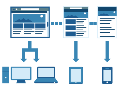
 Responsive design is an approach to web page creation that makes use of flexible layouts. The goal of responsive design is to allow web pages to detect the visitor’s screen size and orientation and to change the layout of the website accordingly.
Without responsive design, website visitors, on a mobile phone or tablet, usually have to double tap or pinch and zoom to view certain areas of a web page.
Instead of using fixed-width parameters, responsively-designed pages use mathematical percentages for resizing elements of a web page, which allows for a more fluid layout and a better user experience across different devices. The website navigation, text and images automatically resize to fit the size of the display.
Another advantage to responsive design is that a separate mobile version of a website would not have to be built just to accommodate mobile devices.
Is Responsive Design right for everyone?
The short answer might be YES. However upon a closer look, one might say NO!
There are a number of things to consider when offering Responsive Design as a web developer.
- First, will every design that a graphic designer creates fit the Responsive Design approach?
- Will the client be able to afford the extra time that it would take to create the right art work and then the time it takes to make that design Responsive?
- Will the client truly like what happens to his design, when the Responsive technology kicks in
Let’s look into it:
Will every design that a graphic designer creates fit the Responsive Design approach?
 The answer to this is simply no. The designer needs to understand how Responsive web sites work in order to best create a design that will work correctly on all devices. Close attention must be paid to every design detail. When shapeshifting kicks in, the site does not look like a steaming pile of you-know-what. This takes extra time on the designer’s part as well as the developers. This can add considerable cost to a project. This takes us into the next question.
Will the client be able to afford the extra work that it would take to create the right art work, and then the time it takes to make that design Responsive?
Most clients are concerned only with the bottom line, and don’t take time to consider what it really takes to make their web site a Responsive one. (Even when we try to educate them on the resources needed to make it happen!) The honest truth: adding responsive technology to a web site can come with some sizable costs. In today’s economy, prospective clients tend to shrug off adding responsive design when they find out how much more it will cost.
Will the client truly like what happens to his design, when the Responsive technology kicks in?
Responsive Approach!
When a Responsive site kicks in on handheld devices such as tablets, iPads and smart phones, they go through a shape-shifting that can change how the design was meant to be seen. True, you won’t have to pinch screens in and out but the site will take on a different look from the original design concept.
Non-Responsive Approach!
These types of sites show up on all mobile devices. However, in most cases you’ll have to pinch the screens in or out as needed. You will retain the original design’s look and feel, but the site will be much smaller.
Weighing the two options from an artistic and usability point of view may change a client’s perspective once they understand how these two approaches work.
Conclusion
 Responsive design is here to stay. It is a great technology and solves age old viewability issues on mobile devices. One day, the majority of web sites will have Responsive Design built in at the core of the platform. Until then, Web Designers will have to do their best to educate the world as the Internet continues to evolve.
I find it interesting that this is being posted on a website that doesn’t appear to offer a separate mobile layout or incorporate responsive design.
Hi Andy. Good point. We haven’t had the need to focus on our mobile users. However, as visits increase from mobile devices (ours is currently at 11% of overall traffic), we might consider a mobile-specific or responsive site. Our site was designed three years ago and we are actually just now in the concept phase of a new site design that will be ‘responsive’. Thanks for your feedback.